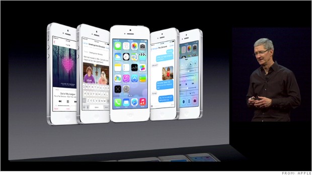
 Apple showed off its newest and most radical redesign of their iOS platform with the announcement of iOS 7. The operating system design features a new color palette (think Easter colors), a responsive background, more white space, and a cleaner look that eliminates the real world like elements (i.e. glare on icons) of previous versions.
The reaction across the web is best described as mixed, with some people praising the new look, and others wishing Apple left their popular design alone.
iOS 7 looks sick but it kinda looks kiddish to me, like something that would be in a children’s game haha idk
— elisa (@dontlovelisa) June 10, 2013
I think it’s the icons that are putting me off iOS 7. The rest of it is OK. — Paul Watson (@paulmwatson) June 10, 2013
The Easter Bunny called. He wants his color palette back from iOS 7. — Eric Zeman (@phonescooper) June 10, 2013
So other than the calendar, I haven’t found a single thing I like better about iOS 7 yet. This is troubling.
— David Pierce (@piercedavid) June 10, 2013
not relaly impressed with #IOS7 — Still looks kinda cheesy to me and incorporates much of what android already includes… #yawn
— Tyler Patterson (@TpatMN) June 10, 2013
IOS 7 is sweet. but keeps reminding me of windows and android.come on apple. don’t do that.
— Chad Kenneally (@Chad757) June 10, 2013
iOS7 looks exactly like my Android operating system…only with brighter colors.
— Dano (@drs06) June 10, 2013
Seeing mixed reviews about the ios7 on my timeline.
— ☥Tati C.☥ (@MonCheri_Tati) June 10, 2013
for me personally i like the new ios 7 it looks much more modern and elegant
— santiago gutierrez (@GutiMane7) June 10, 2013
From comments from my very non-techie friends and family on FB, it seems iOS 7 is a hit.
— ßen ßajarin (@BenBajarin) June 10, 2013
